|
|
|
PhotoShop Basics for
Photographers
|
|
When it comes to digital photography (and that includes scanning
your slides/negatives/prints into digital as well as acquiring them
in digital with a camera) nothing beats Photoshop as the other
"half" of your camera.
It's pricey and worth every penny. Loaded with features
(many of which you'll never use) it also has extremely easy to use
functionality that will dramatically improve each and every
photograph you take.
Because it's such a deep program and because it can do a whole
lot more than "simply" improving scanned or taken digital
images, the usual basics of Photoshop that are taught or written
about leave a lot of beginning photographers bewildered and
wondering if they made a mistake in buying Photoshop. So
here's the crash course (and everything you need to know to get your
photos looking picture perfect).
(Note: while the menus will be somewhat different, these
techniques apply equally to Photoshop Versions 4 through 6.01.
I will refer to the 6.01 menus but if you have any difficulties
working out the process in any other version feel free to email us
here).
|
|
Choosing your Output |
|
The absolute first decision you need to make is where your image
is going. This will affect a lot of your choices down the
road.
The two main choices are output to print, and output for the
web. They differ in resolution -- for print we want to keep as
many pixels as possible, and for the web we'd like to discard as
many as possible.
What I normally do is prepare a web sized image and then if I
decide to create printed output I'll go back to the original and
work from there. If the thought of making two separate sets of
adjustments drives you crazy (and you have need of both web and
print versions) then make a version targeted for print and use
Photoshop's Save for Web menu item (off the File menu) on
that. You won't be getting an optimum web shot, but it will be
close.
|
|
Output
for Print |
|
If your target is your printer then your number 1 priority is
saving as many of those precious pixels as possible while printing
at the size desired.
To do that we need to get familiar with two Photoshop dialog
boxes: the first is Image/Image Size.
Image Size allows you to adjust the printed height and width of
an image. It does this is two distinct and very different
ways: it will either adjust the resolution (pixels per inch) of the
image, or it will resample the image.
Resampling for print is very very bad. Repeat after me:
resampling for print -- just say no. I want to repeat this
several times and elaborate on this because this might be contrary
to what you've heard (or read) elsewhere.
When Photoshop (or any other program, for that matter) resamples
downward (that is, creates a smaller image) it will be discarding
those precious pixels we need and love. Those pixels are what
give detail to our image, so it's pretty obvious that we do not
want to discard any of them.
When Photoshop resamples upward it's even worse -- here PS is
"guessing" at what pixels might or should be there.
Like any computer, it's not very good at guessing (computers are
much better when they "know" something, as opposed to
guessing at it). PS resamples upward pretty good, not as good
as a dedicated program like Genuine Fractals (which makes a living
doing that kind of guessing) but you don't need to use either PS or
Genuine Fractals.
The secret is that you already have software that will be doing
the resampling for you, and doing it much better than any outside
program can do. It's called your printer driver, and it knows exactly
how much resolution it needs to print the best. In the case of
photo printers, which are optimized to work with the best resolution
they need, no other program can know in the same way what's best for
your printer -- trust me.
So how do we make the image the size we want without resampling?
Just uncheck that box in Image Size. Now you see that you no
longer have the ability to enter the number of pixels you'd like (up
above) but only the width, height and/or resolution of your image
down below.
Don't enter the resolution -- that will only buy you a certain
width and height. We want to specify exactly how big we want
our print, and our printer driver will do the rest.
Since it should go without saying you want to leave Constrain
proportions on (unless you're going for a funhouse effect) you'll
note that you can only adjust either the height or the width
but not both. The only trick here is to preserve those precious
pixels, so you need to adjust the dimension that ends up the
smallest. So, for example, if you want to adjust a landscape
shot (an image shot with the largest dimension running horizontal)
then you adjust the height for the dimension you want (since it's
the smallest). Let's try an actual example.
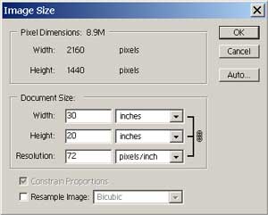
Here we have the number of pixels the Canon D30 produces in a
landscape shot, 2160 x 1440, which at the default resolution of 72
pixels per inch produces a 20 x 30 inch print.
That's probably too big for most of your printers, and in this
case we'd rather do something a little smaller, like 8x10. So
we adjust the smallest dimension (the height) downward to 8 inches
(which is the smallest dimension on our print size).
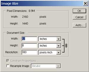
Now we end up with an 8x12 inch print, which is right in the
ballpark now. Notice the resolution has increased, to 180
pixels per inch, but we don't really care about that.
We need to get rid of those two extra inches, and to do so we
need to crop them out, using another Photoshop dialog. After
saying okay here we go to Image/Canvas Size.
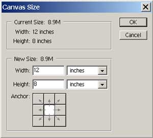
This is where you can crop your image down to size.
Remember, we don't want to discard any pixels we don't have to, but
in this case we have too many pixels in one direction to print on a
common print size. The image is too wide, so we enter 10 in
the width size. If we were to say okay here PS would (after
warning us) chop off an inch off each side.
If we want to keep one side we can use that funny looking nine
square box called Anchor. Selecting either the middle right or
middle left square will preserve the right or left of the image
accordingly. Then the entire two inches will come off the
other side.
If you've been composing correctly you'll usually use the middle
default anchor, but there are times you want to tweak a
little. What if you'd like to chop off 1/2 inch on the left,
and 1 1/2 inches on the right? Just use the Canvas size dialog
twice -- the first time enter 11 inches in the width box and select
the left most middle box. This will chop 1 inch off on the
right. Now enter Canvas Size again and put 10 inches for
width, but leave the anchor in the middle. Now you've chopped
another inch off, equally divided between the right and the left (or
an additional 1/2 inch on the right and 1/2 inch on the left).
One last thing you should know about image size and output -- not
all file formats save the pixels per inch information. If you
were to save the image as a TGA, for example, after setting it up to
print at 8x12 and then brought it back in again the pixels per inch
setting would have changed, and you'd be printing that 20x30 inch
monster. TIF preserves this information, as do some other
formats.
Someone asked recently if using the Print Options menu (not
available on versions of PS prior to 5) would result in the same
thing as the above process.
The answer is a qualified yes -- you can use Print Options (see
below for dialog box) as it does exactly the same thing as adjusting
the dimensions -- that is, it will adjust the resolution
independently. So why bother learning about the above?
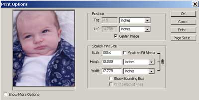
The simple answer is you really don't -- except there are times
it will be helpful to understand the process. Because there is
no way of seeing the pixels and resolution you are adjusting here,
you really can't see what's going on. Because we really can't
print at resolutions that are too low it's helpful to
understand just how large you can make any image before you reach
that threshold. If you are only working with a set of images
for which you are familiar with the resolution (you always shoot a
certain camera, and it always produces a certain resolution) you can
safely ignore the image adjustment procedure and use Print
Options. But like with any shortcut you only take it as long
as you are familiar with the long way around (otherwise you'll get
lost).
|
|
Output
for Web |
|
For the web our problem is the exact opposite -- we want the
fewest pixels possible that still produce a good image.
That's because we all don't have DSL in our homes just yet, and
the smaller the image the faster it will load (and we're all
impatient on the web). The good news for those of you using PS
5.5 or greater is that Photoshop has automated this process with
their File/Save for Web routine.
You'll still need to crop for artistic purposes if desired (and
you have more latitude here, because unlike for print you're going
to have way too many pixels to begin with, so any cropping you do
just makes the discarding that much easier). In this case we
want to reverse our process and use the Image/Canvas Size dialog
first. We crop as desired and then we go to File/Save for Web.
In that dialog you'll be giving a bewildering amount of options
and possibilities, but you really only need to consider two
things -- how big an image you want, and what degree of JPG
compression you want to apply.
I would recommend for the compression medium, nearly
always. Most people can't tell the difference at any higher
levels, and medium is a good compromise for loading
times.
Size is completely up to you. Since most people are still
not using monitors with anything more than SVGA resolution (800x600)
you'll only be making people do a lot of scrolling if you make your
image any larger in either of those two directions. Further,
remember that those are the absolute limits of the monitor -- put an
image in a browser program and you've further reduced the pixels
available to you. Unless you just like making most people mad,
I'd stick with 600x400 or less.
|
|
Leveling the Field |
|
Now that we've got our image correctly sized, it's time to do some
adjustments. The first, and most important, adjustment we make
is our image levels.
You can think of levels as the amount of output at which the
various pixels differ from each other. We want the parts of
our scene containing our "whites" to be the whitest they
can (without blowing out the highlights, or making them so light
they lose any details in them) and the parts of our scenes
containing our "blacks" to be the blackest they can be
(without losing shadow details).
When most beginners think of such adjustments they think of
Brightness and Contrast, and in a way they are right. But
Brightness and Contrast adjust the levels overall in the image, and
aren't very precise. To get more precision we use the
Image/Adjust/Levels menu command.
Beginner's might be tempted to use Image/Adjust/Auto Levels, but
don't you fall into this trap! Auto Levels is not only very
sloppy, it does color adjustments that you might not want to
do. Since you give up all control when you use Auto Levels,
and since adjusting levels by hand is so very easy, there really
isn't any excuse to not do it yourself.

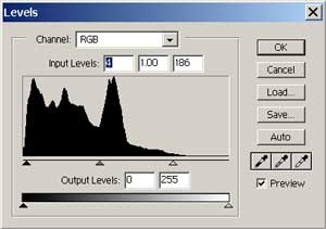
Bringing up the Levels dialog shows you a graph in the middle for
Input levels, sliders at the bottom for Output levels, some
eyedroppers at the right and the ability to save and load in saved
level settings (only really useful if you have a set of images taken
at identical times with the same subject -- a series of rapidly
fired images, for example).
We're only going to concern ourselves with Input levels
here. Output levels probably have their use, but I've never
found one yet. You'll note we have three sliders at the bottom
of the graph. The one at the right controls the highlights,
the one at the left the shadow or blacks, and the one in the middle
controls the midtones (duh).
Adjusting levels is easy and fun with the Preview button
checked. Make sure you can see your image (move the Levels
dialog if you need to) and examine your graph. If it's nice
and even across the board and doesn't drop off dramatically at one
end or the other, you don't need to do anything.
Chances are, however, that one end or the other will be very
shallow, or non-existent. In our example above, it's the high
end that's in sore need of fixing, as it's flatlined quite a
bit. Drag the appropriate slider towards the middle and
watch what happens to your image as you drag.
You want to drag your highlights slider towards the middle until
you blow out the highlights (they lose detail). Then back it
off slightly. You want to drag your lowlights towards the
middle until you start to lose shadow detail. That's about all
there is to it -- you can adjust your midtones if you want, but most
of the time adjusting your highlights and lowlights will take care
of the midtones properly. Here's how the above graph looked
after we made the appropriate adjustments:
For a real eye opener after you've adjusted your levels properly
uncheck the preview and note how much difference your adjustments
have made.
This will bring snap and vitality to nearly all
photographs. Every now and then you can't improve an image
with levels -- consider yourself very lucky with that shot.
Other times you may want a very flat shot and not want to juice up
the levels much. It's your image -- do what you want.
There's another trick with levels you will want to be aware
of. There are times that you don't want to adjust the entire image. Here's a
classic example -- an interior with light coming in from the outside
as well as bright lights in the picture itself. want to adjust the entire image. Here's a
classic example -- an interior with light coming in from the outside
as well as bright lights in the picture itself.
If we adjust the levels for the dark lower portion of the image
we'll blow out both the ceiling lights as well as the outside door
lighting. There are many ways of fixing this image -- we'll
leave my favorite technique for last <g>.
One way we can fix this image is by putting a levels adjustment
layer on the image.
Adjustment layers (Layer/New Adjustment Layer, then choose
Levels) are initially put on the whole image. We adjust for
the parts we want (in this case, the dark lower half), which will
blow out the highlights as we expected. Now we want to
selectively paint out the mask that is applied to the layer.
With the layer selected as our active layer, we choose black for our paintbrush and paint the parts we
don't want to be adjusted -- like with any mask black makes the mask
transparent, white opaque, and levels of gray in between various
degrees. After we've painted the parts we want we then apply
Gaussian blur so our edges aren't distinct, and we end up with
layers that look something like the dialog here. choose black for our paintbrush and paint the parts we
don't want to be adjusted -- like with any mask black makes the mask
transparent, white opaque, and levels of gray in between various
degrees. After we've painted the parts we want we then apply
Gaussian blur so our edges aren't distinct, and we end up with
layers that look something like the dialog here.
This has the effect of applying the levels adjustment anywhere the mask is white, and holding
it back where it is black. So now our picture is correctly
adjusted as shown here. adjustment anywhere the mask is white, and holding
it back where it is black. So now our picture is correctly
adjusted as shown here.
Adjustment layers are good for more than just levels, of
course. Levels, Hue/Saturation, Color Balance and a whole slew
of other useful effects can be applied in this selective
manner. Indeed, using this same general principle there is no
Photoshop effect we can't apply selectively (but we'll cover that in
another lesson).
In the Levels dialog you may have wondered what those eyedroppers
are for. The theory is if you select the rightmost eyedropper
you'll be able to set the white point for your image (and the
leftmost selects the black point). You can try this if you'd
like, just to see what happens, but in actuality if you really do
select the brightest white point and the darkest black point you'll
be doing exactly what Auto Levels does (and it ain't good).
However, there is a very good use for the middle
eyedropper. The middle eyedropper will set your 50% gray
point, and this will adjust your overall color for the image.
If you have an image that has a color cast and you'd like to get
rid of it you can try the gray eyedropper. The trick is to
find a 50% gray in your image -- try clicking a few different places
to see what happens. Sometimes this is the absolute easiest
(and best) way to color correct, but it won't always work (you may
not have a 50% gray or even something close in your image).
It's worth a try, but only after you've adjusted your levels (and
exited the levels dialog) -- you can always undo the damage.
If you are much too advanced for levels you can adjust your image
through the use of curves. Curves are similar to levels, but
have as much in common to levels as levels do to Brightness and
Contrast. There isn't anything you can't do with curves that
you can do with levels, but the reverse isn't true. Once
you've mastered curves you don't need to read anything that I'd
write here about Photoshop.
But Softly
My favorite adjustment technique, one that I haven't shared
before now, is simplicity itself. It works best with a
pressure sensitive graphics tablet, although it can be done with a
mouse (but if you are into editing with Photoshop at any other than
a very casual level, you're going to want a graphics tablet.
For around $100 for the excellent Wacom Graphire,
there's no reason not to have one).
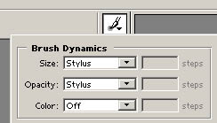
For this trick you apply a new layer from the Layer menu, and set
the mode of this layer to Soft Light. If you have a graphics
tablet set in Photoshop the brush dynamics of size and opacity to
Stylus (see below) -- when you press on the brush you'll control
with pinpoint accuracy the feathering of your brush.
Now when you paint with white you'll burn your image , and black
will dodge it, just like an old time darkroom. If you make a
mistake you can use the erase to erase it. With a graphics
tablet and this technique you can adjust a troublesome image in
seconds.
Which of these do you use? Quite frankly, there are times
it's best to use both. If your image is one that contains
broad areas that need readjustment, a levels adjustment layer is
probably best. If your image is more complicated, with many
areas that need highlighting and lowlighting, the Soft Light will be
the ticket. Master both and you'll be a Photoshop expert!
Note that the true beauty of both of these methods is that until
you actually merge that top layer down, your image is fully
intact. Indeed, it's often helpful to click the eye icon for
that top layer on and off so you can see the difference in your
image. Once you're satisfied you can merge the layers down (or
save as a PSD, which will preserve the layer information).
|
|
USM Forever |
|
The last "basic" tool in the Photoshop photographer's
toolkit is the UnSharp Mask filter, or USM as it's generally known.
We won't go into the technical details as to why here, but all
digital images require some amount of USM adjustment. The only
issues to be discussed are the amount and how to apply it.
There are as many ways to apply USM as there are Photoshop
enthusiasts, and everyone has their own favorite method. We'll
show you the simplest way first and talk about a few others.
The first way is to just bring up the USM filter in the
Filter/Sharpen/Unsharp Mask menu item. Note there are other
choices in this menu to sharpen -- do not use them.
Nothing beats USM and those other methods were put in by the evil
programmers at Adobe just to confuse us.
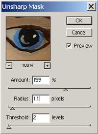
The Unsharp Mask dialog has three controls: Amount, Radius and
Threshold. You can read all about these in the PS online help,
but I would suggest you start with the settings noted above for high
resolution images (such as from the D30).
As always, you can preview the results as you adjust. Just
make sure you preview at or near your full resolution. If
you're only looking at a 50% window it will be difficult to judge
the effects of sharpening.
About the only time I don't apply a lot of sharpening is for
portraits. I consider the lack of USM in a portrait as the
digital equivalent of the soft focus filter in film photography,
except that it's much more subtle.
Applying USM in this manner applies it to the entire image.
Many PS enthusiasts have noted that, since nearly all of the detail
in an image is contained in the luminance channel, the best way to
apply USM is to only that channel (and thus avoid introducing
artifacts in the color information).
Just what the heck is the luminance channel? It's a channel
of information where the differences in luminance (or brightness)
are contained, as opposed to the channels which contain information
about the color. The easiest way to see luminance is to change
your image to LAB format (Image/Mode/Lab Color) and take a look at
the various channels one at a time.
If you do this you'll see that the L channel (luminance, although
PS stubbornly insists upon calling it Lightness) is what makes or
breaks an image. Apply your USM filter to only this channel
and then convert it back to RGB and you've probably got a better
image than doing it in total RGB.
I say probably only because a difference that makes no difference
is no difference, and if you can't see any difference then it isn't
worth doing. Over the last six months or so I've gone back and
forth between doing USM on the whole image and doing it in LAB only,
and now I'm just not so sure it's worth the effort to convert to
LAB. But try for yourself and make your own judgment.
If this weren't confusing enough, there's still another way of
applying USM to only the luminance channel without switching to
LAB. First, apply the USM as normal to the whole image.
Now (in PS 6 -- it differs slightly in PS 5 and earlier) go to
Edit/Fade Unsharp Mask, and choose Luminosity in the Mode dropdown.
This isn't exactly the same as doing it in LAB, but it's
close. Experiment and see what suits you best (but for
goodness sake use one of them).
|
|
Color Me Happy |
|
About the only other thing I do normally to my images is to apply
color adjustments, as needed. We've already mentioned above
using the gray eyedropper in Levels to fix color casts. You
can also use Image/Adjust/Hue Saturation to fix overall color
balance and saturation (one thing I do for my Epson 1270 is to apply
about 15% more saturation before printing. On screen it looks
garish and pretty awful, but it prints very nice).
While Hue/Saturation is the equivalent of the Brightness/Contrast
hammer, Selective Color is more like using levels. Selective
allows you to add or subtract to various aspects of your hues, using
the best instrument you have, your eyes, to tell you what's best.
And, yes, you can use Curves to fix color as well -- there isn't
anything Curves can't do (they just require a great deal more
skill). |
|
Retouching
Retouching is the art of subtly manipulating an image so that it
looks better than the original. Retouching is not image
compositing, large scale changes to an image, or distortion of an
image. Done right, a retouch job should be so skillful no one
could possibly suspect what was done.
Retouching used to mean getting out an actual pen or airbrush and
working over a printed photograph with ink of various sorts.
It was a process that required huge amounts of skill, and a good
retouching could command a nice salary working in the top magazine
shops.
Nowadays retouching is practically a breeze -- since nearly all
magazines work with digital images at the final end, and since the
software has become incredibly sophisticated at doing nearly
anything you want.
We'll concentrate on the three basic tools of retouching here in
Photoshop: the rubber stamp tool, the smudge tool, and the brush
tool with layer effects. If you master all three of these
you'll be able to do just about anything you need to do when it
comes to retouching.
Using these tools with a graphics tablet (even an inexpensive one
such as the excellent $99Graphire from
Wacom) is much better than using a mouse -- with a tablet you'll be
able to feather your edges with precision and ease using the
pressure of the pen. However, all the techniques we'll talk
about can be done with a mouse (but think about getting a tablet if
you do even a small amount of retouching work).
The Rubber Stamp
The Rubber Stamp is one of the most useful and misused tools in
the Photoshop arsenal. The boon and bane of retouchers, it can
enable you to do nearly anything to an image, including removing
things (like people) which were there originally, and putting things
(like clouds) in your image which weren't there to begin with.
Our problem with this tool lies not in its use -- we'll leave the
debate over image manipulation for another time -- but in it's
misuse. First let's talk about a typical application for it
.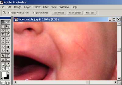
In our image above, the baby has a scratch on his face that his
mother would rather not see in his portrait. We can remove
this in a number of ways, but the Rubber Stamp tool is the easiest
and fastest. First we begin by selecting the tool and, if we
have a graphics tablet, setting it for size and opacity. Now
we sample an area just above the scratch, by pressing the Alt key
down with our cursor in the desired area.
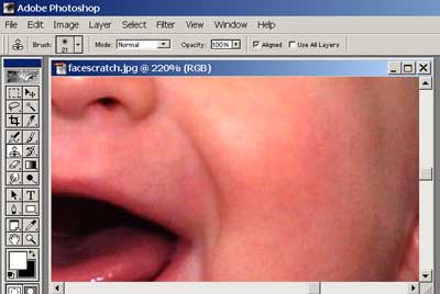
Now comes the part that separates the photoshop men and women
from the boys and girls: to use this tool you do not
"paint" with it. It's not called the Stamp tool for
no good reason. You want to stamp down the areas you wish to
cover, moving your cursor from point to point and slightly up and
down (this will be a lot easier with a tablet). You may
have to shift your sampling point to below the area desired, to
cover more effectively. And this is one of those things that's
much easier to do than to describe. But eventually it will
look like this:
If you paint with the Rubber Stamp tool, no matter how carefully,
you'll end up with tell tale patterns that can usually be seen even
by the untrained eye. These cry "manipulation" more
than any other PS technique, so learn to use the Rubber Stamp tool
right and you'll fool even your best friends (and isn't that what
life's all about?)
The Smudge Tool
While the Rubber Stamp tool can be used to do nearly anything,
there is another specialized tool that's terrific for getting rid of
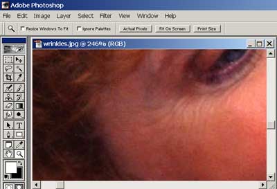
wrinkles in portraits.
In the old days of photography we used to put gauze in front of
the lens, smear a glass filter with Vaseline, or use a special
"soft-focus" filter to make our glamour portraits of even
older folks look, well, glamorous. We all get wrinkles,
even with the best of genes, and using Photoshop techniques we can
get rid of them far better.
The problem with using any of the old techniques or the modern
equivalents (like using filter/blur on the whole image) is you end
up blurring the important details of the image, like the eyes
themselves. But luckily we can selectively apply a tool that
will remove wrinkles like the way they advertise face creams, and
that's the Smudge tool.
You apply the Smudge tool like you would any paint brush, using
gentle strokes to blur the edges of the wrinkles. Note we're
not going for a completely smooth look here -- that will look odd
when we pull back from the image. The result here looks just
fine at normal magnification.
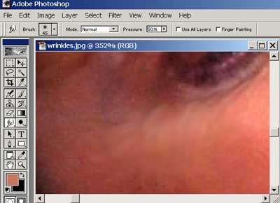
You might be tempted to use the Blur tool instead of Smudge but
Smudge really works better. But try both to see the difference
and decide for yourself.
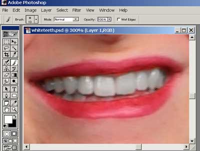
Brushing with Color
The last tool in our arsenal is really our old reliable Brush
tool, but using it in a very cool way. It can solve a variety
of problems, but the most common are red-eye and yellow teeth.
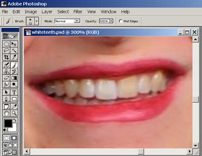
A lot of us suffer from not having perfectly white teeth, and
luckily this condition can be easily corrected. To do so we
bring up another layer on top of our image, and set the mode to
Color.
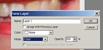
Now we grab our paintbrush and paint in white on this layer, over
the yellow teeth. Presto, just like the ads say, "You'll
wonder where the yellow went..." Note that we use a
separate layer for this even though we could set our brush to
the Color mode and paint directly on our image. The reason we
do this is simple: if we make a mistake (like removing color from
the lips) it's easier to fix by just using the eraser on this color
layer.
For red-eye fixes you should set your brush to black -- this
works as long as the eyes should be a darker color. For blue
eyes you will need to set it for the appropriate color and work
gently.
|
|
Where
do I go from Here?
There are a whole slew of useful Photoshop tips at the Wacom
tablet site. Even if you don't have a graphics tablet,
this URL is worth visiting.
Follow all the tutorials there and you'll be a Photoshop expert
in no time. |
|